Brand
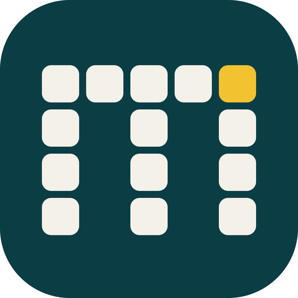
The MAECLY mark.
Concept 02, “Celdas”: a lowercase m built from fourteen modular cells on a 5×4 grid. Each cell is a product; together they are the house. The gold cell is Quito, where it starts.
Chosen by Miguel on 18 October 2026.
01
Logo files










02
Clear space and minimum sizes
- Keep one cell of clear space on every side: 8/64, or 12.5% of the symbol’s width.
- In the lockup, the gap between symbol and wordmark is two cells (16/64).
- Smallest size for the full cell grid: 24 px.
- At 16 px use the solid variant: the cells merge into a solid m and the gold square stays at the top right.
- Smallest wordmark: 72 px wide.
- Squircle radius: 15/64 (23%), in line with the product icons (19–28%).
 48 px24 px
 16 px
16 px
 72 px
72 px03
Palette
04
Typography
- Display · Inter TightSoftware that doesn’t lie.
- Text · InterLocal-first tools, made in Quito.
- Mono · JetBrains Mono$ make verify 0°13′S
05
Do and don’t
Do
- Use the dark variant (lifted petrol field) on dark backgrounds.
- Use the solid variant for favicons and anything at 16 px.
- Keep the gold cell to one element per view.
- Write the name in capitals: MAECLY. Products are “by MAECLY”.
Don’t
- Recolor the cells or move the gold cell.
- Add gradients, glows, shadows or outlines to the mark.
- Stretch, rotate or re-space the grid.
- Use the cell grid below 24 px, or put the mark on busy photos.
Questions about the brand, or need another format? hola@maecly.com